Sunday, July 24, 2011
The Believing Brain
Michael Shermer talks about his theory of the brain as a ‘pattern believing machine’. Put simply, we first believe in patterns subconsciously, then add logical explanations post hoc. This partly explains why debating passionate people on their topic of choice often leads each person more entrenched in their beliefs than afterwards, since logic doesn’t govern our already held subconscious beliefs.
He has a book exploring the idea in more detail, and if you want another brief take on his theories you can read one of his articles here.
And the conclusion from one reviewer -
Having presented the case that we form beliefs on the basis of unconscious, often irrational processes, and that all our argumentation in support of these beliefs is then added post hoc and subject to a wide range of cognitive biases which he lists and explains, Dr. Shermer leaves us in a near-hopeless state. The human condition, according to this perspective, is one of deep-rooted, biased subjectivity and perpetual, unresolvable conflict between believers with different sets of beliefs.
Thursday, July 21, 2011
Real per capita wealth trend
As part of my recent habit of examining trends from the perspective of the individual, or household, I have compiled a measure of real net wealth per capita.
The reason for this is to add another perspective to the more general question of how the Australian economy has fared post-GFC.
As you can see, the average Australian's real net wealth is exactly where it was at the end of 2006. Have we really spent four and a half years just treading water?
 The interesting relationship is between the trend in real wealth and the trend in retail turnover. The 2007 peak of per capita wealth also happened to be the end of the growth trend in retail spending. It is also important to note that in the last decade, home values have comprised around 60% of total household assets, which leads on to conclude that the fate of retail rests heavily on the fate of home prices.

The reason for this is to add another perspective to the more general question of how the Australian economy has fared post-GFC.
As you can see, the average Australian's real net wealth is exactly where it was at the end of 2006. Have we really spent four and a half years just treading water?
The Sydney housing boom ripple effect
Sydney is different. Since 2003 rents have risen faster than prices. I imagine the rest of the country would find that hard to believe, given their experience. But this is just one piece of evidence to show that the property cycles in Australian cities are nonsynchronous.
The past twenty-five years of data show that the Sydney residential property market is the least volatile, and is always first to boom. In fact, you can chase the price growth ripples from Sydney and Melbourne across the country – to Adelaide, Brisbane, Perth then Darwin. This might be one reason that such divergent opinions exist in the media, academic and professional circles.

If we looked only at the above graph, we would note that the two biggest markets, and arguably most attractive cities, have had the least growth since 2000. That seems particularly counterintuitive.
But if we look long-term the explanation is clear – Sydney and Melbourne had their major boom years before the other cities in the late 1990s.
Each of the charts that follow this post compare the timing of booms in capital cities against Sydney’s booms. The blue background shading matches the Sydney boom periods, with the red shading the boom periods of comparison cities. This exercise reveals a number of things.
What about from 2011 on? Sydney appears below its long term trend, and it rarely drops far below this trend. The other capitals are above their trend and do fall quite far below trend during economic downturns. My personal view is that Sydney stability will continue.
The other question to ponder is the trends in this period could validly be applied from now on. Deleveraging is the most important new consideration, and we have seen the dramatic affects this can have on asset values if we simply look to the US and some European property markets.
My expectation is that prices will fall until such time as yields are high enough to be attractive to investors who aren’t expecting capital gains in the near future. To me, this might mean yields might get higher, relative to interest rates, than we have seen for 30 years. And for that to happen, prices will fall. Of course, if the RBA drops rates significantly, this will dampen falls, but I doubt lead to the market grinding out modest growth (ie. matching inflation) for a couple more years yet.


The past twenty-five years of data show that the Sydney residential property market is the least volatile, and is always first to boom. In fact, you can chase the price growth ripples from Sydney and Melbourne across the country – to Adelaide, Brisbane, Perth then Darwin. This might be one reason that such divergent opinions exist in the media, academic and professional circles.
If we looked only at the above graph, we would note that the two biggest markets, and arguably most attractive cities, have had the least growth since 2000. That seems particularly counterintuitive.
But if we look long-term the explanation is clear – Sydney and Melbourne had their major boom years before the other cities in the late 1990s.
Each of the charts that follow this post compare the timing of booms in capital cities against Sydney’s booms. The blue background shading matches the Sydney boom periods, with the red shading the boom periods of comparison cities. This exercise reveals a number of things.
- Sydney and Melbourne booms in the 80s and 90s started and finished within a year of each other. In fact, their cycles are the most in synch of all markets.
- Brisbane lagged Sydney’s late 1990s boom by 4 years – making it an early 2000’s boom. This appears connected to the fact that Brisbane’s 1980’s boom lasted about 4 years longer than Sydney’s.
- Adelaide followed Sydney’s lead more closely than Brisbane in the 1990s, and lagged Syndey more closely in the late 1980s.
- Perth’s 2000s cycle was similar to Brisbane, although in the 1980s it had sharper and shorter price rises.
- Darwin is a world of its own - booming when other capitals had prices tracking below trend.
- Brisbane, Melbourne and Perth prices have been ‘catching up’ to Sydney over this 25 year period. This could be because the quality of homes is catching up to those in Sydney, and also due to a convergence of income levels between the cities.
- For some reason, Adelaide is falling behind other major cities (lowest long term growth trend)
- Sydney never falls as far below its trend as any other city. My eyeballing suggests that price volatility is lowest in Sydney.
What about from 2011 on? Sydney appears below its long term trend, and it rarely drops far below this trend. The other capitals are above their trend and do fall quite far below trend during economic downturns. My personal view is that Sydney stability will continue.
The other question to ponder is the trends in this period could validly be applied from now on. Deleveraging is the most important new consideration, and we have seen the dramatic affects this can have on asset values if we simply look to the US and some European property markets.
My expectation is that prices will fall until such time as yields are high enough to be attractive to investors who aren’t expecting capital gains in the near future. To me, this might mean yields might get higher, relative to interest rates, than we have seen for 30 years. And for that to happen, prices will fall. Of course, if the RBA drops rates significantly, this will dampen falls, but I doubt lead to the market grinding out modest growth (ie. matching inflation) for a couple more years yet.
Tuesday, July 19, 2011
Economic images
Sometimes I stumble across humourous images and quotes in which I instantly find a deeper meaning. Here are a few recent ones, and my accompanying thoughts.
The first I stumbled across at Bryan Kavanagh's blog (which is worth a read).
 What makes it funny is that it is so close to the truth. To me, the deeper meaning is that we have lost an understanding with what real productivity actually is.
The next image can be found all over the web now, but to me provides insights into exactly how new technology integrates into society.
 While we can laugh that the publicly run enterprise is stuck with 1960s technology, to me it says much more. It shows that aggregating many new technologies (computing, flight control, materials etc) into one much larger and more ambitious technology (the space shuttle) takes a long time. Also, it shows me that there are lock-in effects. The car has not changed much at all. This is partly because roads and associated infrastructure are still much the same, and drivers are trained to use the same controls in the car itself. This limits scope for macro improvements in car transport. The same applies to the space shuttle.
I also stumbled across this quote -
As Douglas Adams wrote in 1999, "Anything that gets invented after you're thirty is against the natural order of things and the beginning of the end of civilisation as we know it until it's been around for about ten years when it gradually turns out to be alright really." Yes, the world is different now. Do try to keep up
This is an important one to keep in the back of our minds when we imagine seeing society deteriorate before our eyes. I recall that the ancient Greeks worried about the proliferation of written texts, because it meant people no longer needed to remember and recite long passages. Only if you could remember a passage word for word did it show you truly understood its meaning.
The first I stumbled across at Bryan Kavanagh's blog (which is worth a read).

The next image can be found all over the web now, but to me provides insights into exactly how new technology integrates into society.

I also stumbled across this quote -
As Douglas Adams wrote in 1999, "Anything that gets invented after you're thirty is against the natural order of things and the beginning of the end of civilisation as we know it until it's been around for about ten years when it gradually turns out to be alright really." Yes, the world is different now. Do try to keep up
This is an important one to keep in the back of our minds when we imagine seeing society deteriorate before our eyes. I recall that the ancient Greeks worried about the proliferation of written texts, because it meant people no longer needed to remember and recite long passages. Only if you could remember a passage word for word did it show you truly understood its meaning.
Sunday, July 17, 2011
Retail in detail
My recent post on broad retail trends might have provided a reasonable picture of the sector as a whole, but retailing is a diverse beast. One aggregate number is insufficient to describe the performance of the sector.


My approach is to examine retail from a household perspective. Rather than look at total turnover in current prices, I will examine real spend per capita in each of the main retailing subsectors. I do this because economic theory has a lot to say about changes to household spending patterns during economic cycles.
Economic theory would suggest that in boom times, retailers of luxury goods would see turnover increase more rapidly than incomes. As Wikipedia explains - In economics, a luxury good is a good for which demand increases more than proportionally as income rises. The reverse should also be true for these goods.
Importantly, retail trends need to be seen in the context of a housing driven wealth effect. The wealth effect is an increase in spending that accompanies and increase in perceived wealth, rather than spending which is driven by growth in incomes.
The wealth effect is also behind many of the saving decisions of households. Since 2005 the trend of declining household savings rates was dramatically reversed. We now have a household saving ratio not seen since 1987 (see the RBA’s chart below). This is an important backdrop to the retail story.
These factors are important to consider if you foresee near term home price declines. In this scenario, spending in wealth driven retail sectors would be expected to fall more than flat or falling household incomes, and increased savings alone would suggest.

Now to the detail.
The graphs below show the performance key subsectors in retailing. Note the log scales, which mean a straight line indicates a constant rate of growth – the steeper the line, the higher the rate of growth. Note also that this is a real per capita measure, which is indicative of trends in household spending decisions. Quarterly chain volume data is used, with May 2011 current price data adjusted to substitute for June 2011 data. The ABS explains some of the trends in more specific subcategories here (definitely worth reading the context of this post).


A few points jump out at me from the graphs. First, household goods (maroon in first graph) have outperformed by a long way, for a long time. This category includes furniture and appliances, hardware and gardening, floor coverings and electrical. This sector also appears to have seen the sharpest shock around the end of 2007 – from having the strongest rate of growth to nearly the weakest. The rising part of the curve might partly be attributed to a greater appetite for expensive furniture and appliances, which is indicative of a luxury good effect. Also important is the impact of the construction boom of the early 2000s which has since collapsed in many areas.
Second, clothing and accessories (green line) was on a declining trend for 14 years until 1997. For a decade since then, the growth rate in this sector was only bettered by household goods. Spending recovered strongly since the GFC. I’m not exactly sure why this might be the case. Perhaps some readers have experience in this sector.
Food retailing has been the steadiest (as you would expect) with only a slight easing from the growth trend since 2009 (maroon in second graph).
Other retailing (which includes pharmaceuticals, recreational goods, cosmetics and books) appears very sensitive to the housing wealth effect, seeing big spending boost during the 2002-03, the 2007, and the 2009 house price booms. Surprisingly spending has remained strong since the GFC – the only retail sector where this has occurred.
We might attribute some of the recent robustness to the high Aussie dollar. The ABS explains that pharmaceuticals and cosmetics and toiletries are the strongest components of this sector.
Cafe and restaurant spending (orange line) also appears sensitive to the wealth effect, and is noticeably one of the more volatile sectors.
Department store spending has been declining steadily since the end of 2007 (purple line). Anyone who had closely examined this data would not have been so surprised about David Jones’ recent profit downgrade. Spending at department stores is now back where it was in 2003 on a per capita basis.
Finally, the second graph has the period of 2002-03 circled. This is simply to highlight that all retail sectors grew at abnormally high rates during the house price boom of this period. Indeed, we can see the wealth effect correlation between house prices and retail growth in many sectors in 2007 and 2009, although to a lesser extent.
My near term outlook is for a subdued retail sector. As I have said before, I believe that in these challenging times for retailers, innovation will be the key to staying ahead. New business models that use internet shopping to good effect, with a small physical store presence might be one path for many. Those companies who adapt quickest will benefit.
Thursday, July 14, 2011
The retail picture
Yesterday, my second favourite blog examined trends in retail spending following David Jones' 'shock' profit warning. A long discussion about how best to represent the current retail climate ensued.
So to follow up, I have produced a graph of real pre capita trends in retail spending on a log scale to give, what I believe, is the best picture of retail spending patterns over time. The per capita element is not necessary from an industry perspective, as total turnover drives the health of the industry no matter who spends it. But from a household spending perspective it is revealing.
The peak of this real per capita index is Dec 2007 (dotted line), and is down about 0.35% since that peak. You could say that each persons retail spending has been flat for three and a half years after more than two decades of consistent growth. In the decade prior to this peak per capita real growth in retail was 3.5%pa.
From an industry perspective, real turnover has grown at 1.7%pa since that peak, whereas in the decade prior, real total turnover grew at 4.9%pa. This is clearly quite a shock to the sector, and I hope it stimulates some overdue competition and innovation in retailing in this country (as I have previously discussed).
Bundle of rights explains planning and prices
I have never heard the phrase 'bundle of rights' used in any property market discussions, yet the principle forms the legal basis of property itself.
Put simply, when one buys property they are actually purchasing a bundle of property rights associated with that land title. These rights are granted to the title holder by the State. This bundle of rights approach allows us to distinguish between, and appropriately value, different types of tenure, such as freehold and leasehold, and for differing levels of planning regulation, native title rights, and rights to minerals (which even freehold land owners does not have rights to).
When you value property, you value just those rights that are granted to the title holder by the State. A block of land where the title grants a pastoral lease with 10 years remaining will be valued differently if it was a freehold parcel. Changing the legal rights of the owner may vastly change the market value of the property because the property is different – it is a different set of rights, even though the physical land has not changed.
And so we move on to town planning. Local governments have the power to decide what rights, in terms of land use and scale of development (amongst other things) to grant to which parcels of land through their planning regulations.
When people argue that town planning restricts land market activity and leads to higher values, they are generally confusing basic economic theories of production with fundamental theories of valuation of property rights.
Tuesday, July 12, 2011
Google economic indicators
I have mentioned Google’s real time price index before. Today I want to go ‘around the grounds’ to see how internet prices and search results are being used as economic indicators.
MIT is doing it with their Billion Prices Project. Their index appears to be very similar to Google’s and appears to track the official index in the US well, and a little advanced. That is promising.

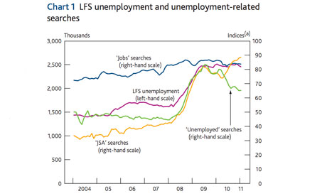
The Bank of England is using search term frequency as a complement to survey data to provide a better picture of the labour market. The chart below shows that quite a few search terms provide an indication of conditions in the labour market.

The Economist uses search term frequency to reveal concerns about the fragility of the Chinese economy. For some reason ‘hard landing’ as a search term is rapidly becoming more popular. (Hopefully this is not because of a new rock band by that name, otherwise that would be embarrassing.)

Economist bloggers are also very keen on the possibilities that Google search statistics present. Justin Wolfers tests some search terms over at the Freakonomics blog, while a local economic blogger finds a strong correlation between the unemployment rate and the search term ‘piercing pictures’. Yes, correlation does not imply causation.

And of course yours truly has used Google search terms to investigate whether Australians believe they are in a housing bubble, with reference to the trends in housing prices and Google searches in the US.

Lastly, the academic community is finding that search term frequency a useful tool as a proxy measure for real life frequency of events.
We propose, based on the premise that the occurrence of a phenomenon increases the likelihood that people write about it, that the relative frequency of documents discussing a phenomenon can be used to proxy for the corresponding occurrence-frequency.
I feel like this is just the tip of the iceberg in terms of the power of the data being collected by Google. And I hope that this valuable data continues to be provided for free to the general public.
MIT is doing it with their Billion Prices Project. Their index appears to be very similar to Google’s and appears to track the official index in the US well, and a little advanced. That is promising.

The Bank of England is using search term frequency as a complement to survey data to provide a better picture of the labour market. The chart below shows that quite a few search terms provide an indication of conditions in the labour market.
The Economist uses search term frequency to reveal concerns about the fragility of the Chinese economy. For some reason ‘hard landing’ as a search term is rapidly becoming more popular. (Hopefully this is not because of a new rock band by that name, otherwise that would be embarrassing.)

Economist bloggers are also very keen on the possibilities that Google search statistics present. Justin Wolfers tests some search terms over at the Freakonomics blog, while a local economic blogger finds a strong correlation between the unemployment rate and the search term ‘piercing pictures’. Yes, correlation does not imply causation.

And of course yours truly has used Google search terms to investigate whether Australians believe they are in a housing bubble, with reference to the trends in housing prices and Google searches in the US.

Lastly, the academic community is finding that search term frequency a useful tool as a proxy measure for real life frequency of events.
We propose, based on the premise that the occurrence of a phenomenon increases the likelihood that people write about it, that the relative frequency of documents discussing a phenomenon can be used to proxy for the corresponding occurrence-frequency.
I feel like this is just the tip of the iceberg in terms of the power of the data being collected by Google. And I hope that this valuable data continues to be provided for free to the general public.
Sunday, July 10, 2011
Thought bubbles

No borders?
Imagine there's no countries
It isn't hard to do
Nothing to kill or die for
In the spirit of John Lennon, what would happen if all countries started a free worker mobility agreement? Where would people leave, and where would their destinations be? Would the world be better off on average? Would it solve many conflicts?
Population arguments
Land is an asset. As the industry would say, they aren’t making any more of it. But shares are also an asset, and most companies aren't make any more shares. So does population growth increase share prices as well? After all, there would be more people competing for the same number of shares?
More support for property – tax deductibility for public servants
Salary packaging mortgage payments seems like just another housing market subsidy available to public servants. A worked example here.
Mere monkeys?
Monkeys trained to use money for transactions (from here)
The essential idea was to give a monkey a dollar and see what it did with it. The currency Chen settled on was a silver disc, one inch in diameter, with a hole in the middle -- ''kind of like Chinese money,'' he says. It took several months of rudimentary repetition to teach the monkeys that these tokens were valuable as a means of exchange for a treat and would be similarly valuable the next day. Having gained that understanding, a capuchin would then be presented with 12 tokens on a tray and have to decide how many to surrender for, say, Jell-O cubes versus grapes. This first step allowed each capuchin to reveal its preferences and to grasp the concept of budgeting.
Then Chen introduced price shocks and wealth shocks. If, for instance, the price of Jell-O fell (two cubes instead of one per token), would the capuchin buy more Jell-O and fewer grapes? The capuchins responded rationally to tests like this -- that is, they responded the way most readers of The Times would respond. In economist-speak, the capuchins adhered to the rules of utility maximization and price theory: when the price of something falls, people tend to buy more of it....
During the chaos in the monkey cage, Chen saw something out of the corner of his eye that he would later try to play down but in his heart of hearts he knew to be true. What he witnessed was probably the first observed exchange of money for sex in the history of monkeykind. (Further proof that the monkeys truly understood money: the monkey who was paid for sex immediately traded the token in for a grape.)
Young property buyers making smart property decisions
Apparently, one in ten home buyers ‘rent to invest’. They choose to rent their principle place of residence, and invest in property elsewhere. This makes perfect sense, and I have commented before why this is always the best way to get financial exposure to the property market – far better than buying to occupy. It is what I’ve always done.
As I said 18 months ago -
What we learn from this exercise is that buying your own home in today's economy is far inferior to buying a home as an investment, or renting and staying out of the property market completely
Carbon Tax to reduce effective marginal tax rates (must read analysis)
People are terrible at objectively determining quality
In Washington , DC , at a Metro Station, on a cold January morning in 2007, this man (image above) with a violin played six Bach pieces. During that time, approximately 2,000 people went through the station, most of them on their way to work. After 45 minutes only 6 people had stopped and listened for a short while. About 20 gave money but continued to walk at their normal pace. The man collected a total of $32. When he finished playing no one noticed and no one applauded. There was no recognition at all.
No one knew this, but the violinist was Joshua Bell, one of the greatest musicians in the world. He played one of the most intricate pieces ever written, with a violin worth $3.5 million dollars. Two days before, Joshua Bell sold out a theater in Boston where the seats averaged $100 each to sit and listen to him play the same music.
Tuesday, July 5, 2011
When to Buy and Sell houses
I came across the Commonwealth Bank - RP Data Home Buyers Index recently. It is designed to estimate the balance of supply and demand in a suburb to indicate whether it is currently a ‘buyers market’ or a ‘sellers’ market. Their website explains:
The Commonwealth Bank - RP Data Home Buyers Index estimates effective supply levels based on the number of properties being advertised for sale within the region.
...On the demand side of the equation, Australia's largest home loan lender, the Commonwealth Bank, provides a summary of the number of home loans that have been funded across Australia. Once we factor the Commonwealth Banks share of market into the equation, the number of home loans funded provides one of the timeliest estimates of housing demand in the market place.
This indicator may signal which direction prices are moving at any point in time, and is therefore a useful tool for market analysts. However, I was wondering if there is a rule of thumb that residential property investors could use to time their entry and exit from the market to maximise returns?
To answer that question I propose Murray’s Retrospective Indicator for Buying and Selling.
Subscribe to:
Posts (Atom)