Showing posts with label Australian economy. Show all posts

Wednesday, May 4, 2011

Demand shocks – the details

Many pundits claim that increasing population increases demand. In technical economic jargon it shifts the curve to the right. But what we rarely see is an exploration of the two types of demand shock and the different potential price impacts.

The first type, as mentioned above, shifts the downward sloping demand curve to the right. This means there are more people with the same willingness to pay.

The second type is a shift of the demand curve up upwards. This represents a willingness to pay more for the same goods from the same number of people.

It’s pretty clear from this distinction which of these factors is in play in Australian housing.

Let’s examine the first case. Consider an auction with 10 cars for sale and 50 bidders willing to pay $1000 for a car. You add another 50 people to the mix each also willing to pay $1000. If I’m not being clear enough, this is analogous to increasing population in the housing context.

When the auction is run with the original 50 bidders each car sells for $1,000. When the auction is run with 100 bidders, the 10 cars still sell for $1,000 each.

This is an extreme scenario but does demonstrate a very real point. Unless the new potential buyers are willing to pay more for the same items as the existing buyers, the price won’t rise. At most, a second price auction (the result of an English open auction with heterogeneous preferences) becomes closer to a first price sealed bid auction by the addition of another bidder willing to bid at a price between the second and first price (read up on some auction theory here).

As I said before, new buyers, even a small cohort of the total market, can influence the price level if they are willing to pay more than the existing buyers, since prices are set at the margins. Imagine our car auction once again, and we give 10 of our original 50 bidders and extra $500 to spend on the car. What is the new result? All cars sell for $1500 each to these 10 bidders. Even though they were just 20% of the original market of buyers, they dragged the price up 50%. In fact even if there were thousands of buyers willing and able to pay $1000 for those 10 cars, the ten people willing to pay $1500 would always win.

Prices are set at the margin by those with the highest willingness to pay.

This example, where the demand curve is shifted vertically to reflect an increased willingness to pay by the same number of buyers, is shown graphically in the right hand side graph above.

But, you say, the key problem here is that supply is being overlooked - in the simplified examples demand curves are horizontal and there is no supply response. But look at the graphs again. Not only is the demand curve a more acceptable shape, but supply does respond in both circumstances. In the first, where the demand profile of buyers shifts horizontally supply does respond enabling prices to remain at their equilibrium level.

However, when the demand curve shifts vertically, it doesn’t matter how much supply responds to price increases, it cannot be a mechanism to bring prices back down (except under extreme assumptions about the shape of demand and supply and the limits of peoples willingness to pay at the top and bottom of the market).

Of course, in the end this analysis is probably unecessary. The value of housing arises from the rents - its ability to generate revenue or provide a service. Since we haven’t seen rents outpace inflation significantly for any extended period in the past two decades, one must be quite certain that the cause of prices being much higher than a rational present value of future cash flows is pure demand side speculation.

Tuesday, April 26, 2011

Milk wars and Anti-Dumping

While there are many questionable assumptions in some economic theories, there are also many solid foundations to economic analysis. One of these was identified by Coles in its submission to the Senate inquiry into milk pricing (available in the Coles factsheet here).

The farm gate price dairy farmers receive is set by the world price because most Australian milk products are exported.


The first implication of this fact is that because prices are set by global markets, domestic buyers cannot buy at prices below the export market price - although they could perhaps be higher.

By following this logic Coles, or any other domestic dairy retailer, cannot exhibit bargaining power as a buyer from milk processors (or distributors). Dairy processors would simply sell all their products abroad, whereas the only alternative for retailers is to buy imported dairy products with associated freight costs.  Processors can then bargain the price up to the price of the retailers next best alternative of imported products. Thus, even though we are net exporters of dairy products we still pay a retail price for domestic dairy products very close to the retail price for imported dairy products.

And to provide further evidence against dairy industry claims, even if Coles did have market power, one must question why Coles would not already be getting milk for the lowest price anyone would be willing to produce for?

The sceptic in me might even go so far as to suggest that upsetting the political milk cart might have been a publicity strategy for Coles itself. News outlets have told the public that Coles is aggressively dropping prices for months now – all free of charge. You really can't buy publicity like that.

Of even greater concern than the media beat-up, and public perception of danger from falling milk prices, is that the law entrenches protection of local industries from international competitors through anti-dumping laws. As the Productivity Commission describes

Sunday, April 17, 2011

Housing supply follow up – more evidence (UPDATED)

I promised to search around for some more evidence that local councils approve far more dwellings than are built. This would go some way to addressing the argument than planning is restrict, particularly zoning controls and approvals processes.

This report, by the Queensland Office of Economic and Statistical Reseach, adds to the previous evidence on a deevlopment approvals for subdivisions greatly exceeding the ability of the market to absorb the new land.  It outlines the number of development approvals for infill multiple unit dwellings in the pipeline at various stages of approval for South East Queensland.

The telling figure is that there are 48,152 approved new infill dwellings in SEQ, with another 29,014 at earlier stages of approval.  Remembering that there are also 30,566 approved subdividede housing blocks, we have a total approved supply in this region of 88,718 dwellings! Even at its recent peak population growth in SEQ was only 88,000 per year.  That makes about 2.5 years supply of dwellings already approved.

Other government reports which have compiled useful information on the potential housing supply available under current planning regimes.

This report notes the following

“...there appears to be a very low risk of the current broadhectare land not providing at least 15 years supply, particularly when the increased density and infill targets set by the SEQ Regional Plan are considered. Based on the SEQ Regional Plan assumptions for infill, then only 244,000 lots would be required over a fifteen year period”

Moreover it explains that the stock of approved lots represents 3.3 years supply.


We can take a look at a national level here and see that current planning schemes have the potential to yield 131,000 new homes per year for a decade from 2008! This excludes the increase in housing stock from developments with less than 10 dwellings.  In the abovelinked OESR report they state that smaller developments of 10 or fewer dwellings accounted for 69.5 per cent of projects at June 2010. This means the estimate of 131,000 new homes accounts for only 40% of the actual supply available under current planning schemes.

Even so, they sum up their analysis of land supply by stating that there was approximately 7–8 years supply of zoned broadhectare land in 2007.  

Tuesday, April 12, 2011

Risk homeostasis, Munich Taxi-cabs and the Nanny State


There is an odd coexistence between two conflicting safety policies that may well be pursued by the same accident prevention agency. The first seeks to improve safety by alleviating the consequences of risky behaviour. It may take the form of seat belt installation and wearing, airbags, crashworthy vehicle design, or forgiving roads (collapsible lamp posts and barriers). This policy offers forgiveness for a moment of inattention or carelessness. The second policy seeks to improve safety by making the consequences of imprudent behaviour more severe and includes things such as speed bumps, narrow street passages, and fines for violations. Here, people are threatened into adopting a safe behaviour; a moment of inattention or carelessness may have a dire outcome. 

While these two policies seem logically contradictory, neither is likely to reduce the injury rate, because people adapt their behaviour to changes in environmental conditions. Both theory and data indicate that safety and lifestyle dependent health is unlikely to improve unless the amount of risk people are willing to take is reduced. (here - my emphasis) 

The above passage points out a common logical absurdity, and contains an important lesson for Australian’s with and overeager obsession of controlling personal choices through ‘nanny state’ regulations. More on the nanny state a little later. 

First, it is important to examine the hypothesis of risk homeostasis to properly understand the implication of the opening quote, since it claims that neither of the two contradictory policies aimed towards improving safety are effective. 

The essential argument of risk homeostasis is that humans have an inbuilt level or risk that they gravitate towards in response to their external environment. If we reduce the risk of an activity, people will compensate by finding other risky activities as a replacement, or undertaking the activity in a more extreme manner. For example, if we ban smoking tobacco, which doesn’t seem like such a remote possibility, do we really expect smokers to replace their habit with fruit snacks and yoga? Or might they compensate by increasing their alcohol consumption or perhaps smoking dope instead. 

Risk homeostasis is not to be confused with risk compensation, which suggests that individuals will behave less cautiously in situations where they feel "safer" or more protected, but that we don’t necessary return to a predetermined risk equilibrium point. 

Improving transport safety is an area where there is strong evidence risk compensation, and indeed of risk homeostasis. 

Monday, April 11, 2011

No evidence of supply-side constraints in approvals data

Possibly the central lesson of my previous post was that planning controls and development approvals by local councils are not a factor that limits the quantity of new homes constructed. Council behaviour in these areas could limit housing supply if councils began a system of quotas for approvals. But they don’t. They provide limitations on the location of new supply in their planning instruments, and they approve the quantity of homes demanded by the development industry - which is a reflection of the number of new home sales. Sales volumes of new homes and land determine the rate of supply of new dwellings. 

In my last post I provided no evidence for my assertion apart from logically examining the process of development in a hypothetical scenario.

So is there evidence that councils are limiting the supply of new dwelling through their planning controls and approvals processes?

No.

Let’s look at my home town of Brisbane. The following table shows the stock of approved house lots in Brisbane and surrounding local council areas that are yet to be developed (All data from here - Table 1. Excludes building units and retirement homes).


In Brisbane, where broadacre land is arguable more physically constrained, the stock of approved housing lots has remained relatively constant. And as you would expect, in the fringe areas, the stock of new house lots has grown far more rapidly than sales of lots or construction of housing. This indicates that councils approve far more housing lots than the market can absorb.

Yet it is this development approval that many claim is a hold-up to development.

In Brisbane, this reserve stock equates to about two years supply, while in surrounding areas there is between 3 and 10 years supply (Logan City and Somerset respectively) already approved. Of course, there are many thousands more lots that could be approved under existing planning schemes should demand arise.

Remember, this is just the stock of new land developments. If data were more readily available for unit developments there will no doubt be a similar story (in Brisbane attached homes are about 50% of new stock).

The clear message that comes from actual data on planning approvals is that they are not a constraint to supply. This might be one reason why these figures are never mentioned by ‘supply-siders’, even in the most detailed documents outlining supply side concerns in the housing market such as the 2003 Prime Ministers Taskforce on Home Ownership Report.

Saturday, April 2, 2011

8 Economic Lessons on Planning and Housing Supply

The housing bubble debate often leads to claims that town planning controls and approvals processes are a contributing factor to the price boom. It is argued that such controls can constrain the rate of housing supply during periods of high demand, allowing prices to ratchet up. But there is no case for the argument that planning controls can influence the general price level of housing.

For those unfamiliar with property development, the following lessons may be of interest. 

Tuesday, November 30, 2010

GDP only positive because of rain drenched agriculture

Today’s National Accounts figures were not a huge surprise - except, of course, to many of the mainstream economic commentators, some of whom continue to demonstrate their undying faith by stating that the decline is nothing to worry about.

Neither are the downward revisions to the June quarter figures worth a second look.  The June quarter growth trend down was revised down from 0.9% to 0.7%, and seasonally adjusted down from 1.2% to 1.1%.

And possibly my favourite lines from the ABS release
In seasonally adjusted terms, Agriculture (up 21.5%) contributed 0.4 percentage points to GDP growth driven largely by strong forecasts for grain crops... GDP increased 0.2% in the September quarter, while non-farm GDP fell 0.2%

If it wasn’t for the surge in agriculture driven by last season’s strong rains, GDP growth for the quarter would have been negative, and for the year, just 2.3%.

Perhaps it is time to revisit some forecasts by our favourite economists back in September.

Peter Jolly, NAB - Our year ended GDP forecast has lifted to 3¼% from a little under 3%
Christopher Joye, Rismark - The economy is about to embark on a period of above-trend growth
Warren Hogan, ANZ - Hogan believes we are about to see a period of serious inflationary pressures thanks to the commodities boom's income wave
Michael Blythe, CBA - reckons the income surge will add 3 or 4 per cent to GDP over the next couple of years.

Yet the serious inflationary pressures and above trend growth seem to be a little hard to come by at the moment.

At least I can give myself a plug.  Heck, isn’t that what economists do?  My prediction from early September - Inflation and GDP will surprise on the low side in the September quarter.

Steve Kates explains much better how the data early in the year was deceptive due to the dramatic impact of fiscal stimulus, and that the private sector recovery is yet to appear. 

Wednesday, November 3, 2010

Talking climate with Warwick McKibbin

I met RBA board member Professor Warwick McKibbin yesterday.  Alas, his reserved academic demeanour was a successful deterrent to a gruelling discussion on monetary policy and his thoughts on Australian housing.

I was, however, enlightened about his academic research and particular area of expertise – macro-economic modelling and climate change.

For such a diminutive guy he manages to raise a large public profile and promote intense debates on matters of macro-economic policy.  He was intensely critical of the government stimulus package, although many economists see it as very well implemented in hindsight.  


Some of the critics of the implementation of Australia's fiscal stimulus fail to see the broader political picture.  Professor Tony Makin, for example, argued that the fiscal stimulus was not necessary because adjustments in exchange rates and interest rates absorbed most of the impact of the crisis.  Yet he gives no credit to domestic impact of fiscal stimulus from abroad, particularly with our main trading partners.  His argument was that we should have been free riding on the stimulus of other nations.

The broader political picture reveals that there was an explicit agreement by G20 nations in November 2008 to take coordinate fiscal action to avoid this very issue.  In an international context our stimulus appears light on – maybe we still did partly free-ride.

But McKibbin is clearly most passionate about climate policy, driving hard his ideas for coordinated global action – The McKibbin-Wilcoxen Blueprint for climate policy.

Monday, November 1, 2010

Rates surprise

The RBA Board decided to raise official interest rates by 25 basis points today against my, and many other economists, expectations. One wonders if they take pleasure in proving forecasts wrong, or whether they are simply following the cardinal rule of monetary policy - defy expectations.

Unfortunately I think it is the destabilising thing to do, and maintain that we may see this decision reversed in the future.  With a housing market waiting to crumble, tourism and education exports fading, commodity prices peaking and inflation already moderating,  expect some sullen economic data this festive season.

Australia not an island away from world’s troubles – recession, bank runs, and printing cash

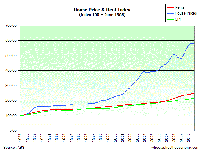
The continued media hype around Australia’s economic stability and security can be partly attributed to the fact that, by official figures, we avoided a ‘technical recession’ during 2008/09, and also that ‘the health and strength' of Australia's banking system played a major factor in domestic economic outcomes following the financial crisis (here for example).

Griffith University’s Professor Tony Makin, however, has a little more to say about whether Australia actually avoided recession. The answer depends on your definition, and we are unique in that respect.

In the aftermath of the GFC in September 2008, Australia's nominal GDP, real GDP measured on an income basis and on a production basis, as well as real GDP per person, all fell over two successive quarters, as did various other national income measures that account for the slump in export commodity prices (or terms of trade) at the time.

Of the many national accounts series the Australian Bureau of Statistics publish, the only one indicating there wasn't a recession was the real, or price level adjusted, national expenditure series.

In the US, a recession dating committee of the National Bureau of Economic Research uses a battery of macro-economic measures, not just the somewhat arbitrary two successive quarters of negative real GDP.

If the behaviour of Australia's business cycle in the aftermath of the GFC had been assessed by an independent committee of economists with reference to a broader range of macroeconomic indicators in this way, a recession, albeit mild, would most likely have been declared for 2008-09. But this would not have been of great concern because, due to greater labour market flexibility, unemployment did not rise anywhere near as much as in the recessions of the early 80s and early 90s.(here)

No doubt business people would have wondered how official figures could have been so out of touch with on the ground realities during early 2009, but a mere statistical discrepancy kept the headlines optimistic.

And as far as the ‘health and strength’ of our banking system, well, let’s just say a better phrase would be ‘government rescue’ of the banking system, with the deposit guarantee and massive fiscal and monetary stimulus.

This extract from the book Shitstorm: Inside Labor’s darkest Days, has far more detail on just how perilously close our own banks were to disaster.

All around the country, banks were facing unusual demands for cash. Small businesses in Queensland and Western Australia were switching their deposits from regional banks to accounts with the big four banks.

An elderly woman turned up in the branch of one bank in Queensland with a suitcase and asked to withdraw her term deposits of $100,000 or more. Once filled, she took the suitcase down to the other end of the counter and asked that it be kept in the bank's safe.

A story did the rounds of the regulators about a customer who wanted to withdraw his six-figure savings. The branch manager said he did not have that quantity of cash on hand, but offered a bank cheque, which the customer accepted, apparently unaware that the cheque was no safer than the bank writing it.

It was a silent run, unnoticed by the media. Across the country, at least tens and possibly hundreds of thousands of depositors were withdrawing their funds. Left unchecked, there would soon be queues in the street with police managing crowd control, as occurred in London at the Golders Green branch of Northern Rock a year earlier.
...
Households pulled about $5.5bn out of their banks in the 10 weeks between US financial house Lehman Brothers going broke - the onset of the global financial crisis - and the beginning of December. That is roughly 80 tonnes of cash salted away in people's homes. Mattress Bank is doing well, was the view at the Reserve. A year later, only $1.5bn had been put back.

The worst problems were in the second-tier banks, particularly Queensland's Suncorp and, in Western Australia, Bankwest. Deposits at the big four banks were surging as customers sold their shares, pulled money out of cash management trusts and put the proceeds in the bank. But at Suncorp deposits slumped by $1bn. They dropped $2bn at Bankwest.

The regulators and the government were gravely concerned for these two banks. Suncorp had total assets of $75bn and Bankwest $60bn. Bankwest was in double trouble because its British parent, HBOS, was teetering on the edge of bankruptcy.
...

Despite their preparation, the Lehman crash caught local banks by total surprise. NAB chairman Michael Chaney had set off on a 13-day rafting trip down the Grand Canyon on the day Lehman failed. He had taken a satellite phone but by the time he got it to work his share price had collapsed by almost 30 per cent. "I couldn't get a helicopter in there, so it was a five-hour climb out," he says.

Balance of payments figures show that in the immediate aftermath of the crash, Australian banks were called on to repay $50bn in short-term debt to international investors who refused to roll over their exposures.

Governments across the world were also being tested. Two weeks after the Lehman crash, Ireland's banking sector was facing an alarming run on larger deposits. The government stepped in and guaranteed all deposits and wholesale fundraising.

There was an immediate call for the British government to follow suit. Within a week, Germany, Denmark and Greece had offered unlimited deposit guarantees, while the British and a number of other European governments had increased the size of their insurance schemes. The Reserve Bank, APRA and Treasury were worried as were the chief executives Wayne Swan was talking to.

The long-standing concerns of the main banks about depositor protection were cast aside. The fate of small institutions could influence the stability of the system.

"One of the lessons of this whole period is you can have an abstract almost clinical discussion in the absence of a crisis about which institutions are systemically important and which are not. But when the crisis hits, is there any financial institution that is not systemically important?" Henry says. "It was my view back in September after the collapse of Lehman, I came to the view there was no financial institution in Australia that could not be regarded as systemically significant."

The issue was so delicate that most cabinet ministers knew nothing of what was going on.

"Some of this stuff is so sensitive, the bank guarantee could only be agreed between the Prime Minister and myself," says Swan. The government's unlimited guarantee of retail deposits went further than any other country, partly because Treasury was now concerned about capital flight.

Tuesday, October 26, 2010

CPI surprise

Today’s Australian CPI data, according to the headlines, was ‘lower than expected”.  This was the first part of a forecast I published here back in early September, when I said “Inflation and GDP will surprise on the low side in the September quarter”.  GDP figures come out with the National Accounts on the 1st December so we had a little while to wait before assessing my prediction (1st November is the ABS capital city price index which may also show some surprises).

But the CPI print really shouldn’t have been a surprise.  Maybe most economists have loyal wives and girlfriends (or husbands and boyfriends, although it is a male dominated profession) to do their shopping, so they wouldn’t have noticed the price declines in food, health, communications and transportation in the previous quarter.

It is evidently odd that the US can experience no price growth with a collapsing dollar, while Australia’s currency has gained strength yet our favourite media hungry economists forecast high inflation and multiple interest rate rises. The high dollar was always going to dampen any inflationary pressures.

On a far more interesting note, Google has been experimenting with a real-time price index compiled, I assume, by experimental software that searches for listed prices of items on the web.  Their index has showed a “very clear deflationary trend” for the US, and has the additional benefit of compiling the same (or at least comparable) indexes across countries.  By the same measure the UK has shown a slight inflationary trend, attributable to the weak sterling.

The automatic nature of the index also provides the possibility of releasing multiple indexes with different scope and purpose, to provide a much richer picture of prices changes across the economy.  For example, hedonic price adjustments can be in one index and not in another, and the basket of goods can be quickly changed to suit different social groups.

There has been a strong push for the ABS to publish multiple prices indexes to address these very issues, particular with regard to quality adjustments.  I have demonstrated the Lower Bound Problem of Hedonic Price Indexes before, although Rob Bray makes the argument more concisely:

Revise the approach to quality adjustment to take account of the actual utility consumers achieve from changes in product ‘quality’; and also consider an approach which reflects the extent to which products actually exist in the market place for consumers to purchase

Twice the quality is not the same as half the price.

The benefits of real-time data available to Google are yet to be fully understood by economists, but there is no doubt the Hal Varian, Google’s chief economist, will change that soon enough.

Mr Varian also discussed some of his other work on using Google’s search data for economic forecasting. He said that he is working on “predicting the present” by using real-time search data to forecast official data that are only released with time lags.

For example, searches for “unemployment insurance” may be a good tool to predict actual claims for unemployment insurance, or the unemployment rate.

This is something I have tested before with the US housing bubble, clearly demonstrating that search volumes can be amazing predictive tools.  It won’t be long before these real-time measures become commonplace in mainstream economic publications.


Wednesday, October 13, 2010

Murray-Darling Basin Plan: Despite extreme lobbying, you can’t take water that does not exist

The release of a guide to the Murray-Darling Basin Plan is receiving very poor media coverage. This headline – “Basin Authority holds its first public meeting” - is entirely misleading. The Authority had numerous meeting with stakeholders including water users, irrigation groups, farmers groups, local councils, and anyone else who could claim and interest for the past two years. There should be no surprises.

Another here – “As many as 130,000 jobs could be lost because of reduced water allocations in Victoria's fruit bowl region under the Murray-Darling Basin plan, a farmer says” That’s right. A farmer says so, therefore it must be true. 

This is a week the farming lobby has spent years preparing for, and they are basking the attention. 

The further problem which is completely overlooked by the media, is that while the reductions in rights to take water are ‘up to 37%’ that means that most reduction in most rivers are ‘between zero and 37%’. 

Let’s not also forget the fact that these are reductions of paper rights, not volume taken. There would be very few water users whose volume taken matches the volume of their rights due to variability and recent dry conditions.  The graph below shows that recent rainfall conditions are below historical averages, although this is not uncommon in the long term.


What is missing from this mainstream media nonsense is any actual thought about the reason the plan was developed in the first place. Simply put, there are more rights to take water ‘on paper’ than there is water in the system. This leads to both downstream water users suffering at the expense of upstream users, and environmental areas suffering due to upstream water users. When downstream environmental assets, such as wetlands, receive water, the water also flows through to downstream users. 

There is even the possibility that the next five years more water will be used by irrigators than the past five years, even with the Basin Plan, simply because of rainfall variability. The percentage figures are based on long run averages, which are a distant memory for many people in the Basin. 

Imagine I give you a piece of paper that allows you to take 100ML/annum of water from a particular reach of a river. The river flow is highly variable and because of this you get 60ML one year, zero the next three, 100ML the next, then 25ML. You average 31ML. Then, you get told the stream is overallocated and you are getting cut 37%, so that your allocation is now 63ML. If we had the previous six years again the impact would have only occurred in one year - the cut would take your five year average from 31ML to 25ML – a 20% decline in average use, and a once in five year impact. 

If over the next 5 years you can take 63ML, zero, 25ML, 50ML, 5ML and 60ML, you might end up with even more water on average – 34ML/a instead of 31ML/a – despite the theoretical cut to you water right.

In South Australia for example, irrigators have only been able to access 10% or less of their water rights over the past 5 years or so. If the Basin as a whole shares the water more equitably, these irrigators may be able to use 63% of their previous water allocation – a 37% cut on paper, but a 600% increase in real water use compared to the past 5 years. 

Even the MDBA itself showed just how low actual water use is compared to these theoretical baseline figures from which reductions are calculated. The graph below is from page 130 of the Guide and shows that the average water use since 2002-03 is equal to their most ambitious reduction scenario.


My point is, people are taking the cuts as real water then multiplying impacts to flow on industries then getting bigger and bigger impacts that border on ridiculous. These complementary agricultural industries are clearly already adjusted to any proposed cutbacks.

The only person to present any figures on the media circus is economist Quentin Grafton. He makes his case that farmers are exaggerating losses as follows: 

"In 2000-2001, the gross value of irrigated agricultural production was just over $5 billion, and they used surface water of about 10,500 gigalitres in that particular year," he says. 

"Fast forward to 2007-08, 70 per cent reduction in surface water use, guess what happened to the gross value of irrigated agricultural production? It changed by less than 1 per cent." 

Not only are impacts greatly overstated but water users will generally be compensated for their theoretical water loss at market prices for water – whether the water exists or not. 

Historically most water rights are a gift from the State to landholders. They have generally earned a good living from these gifts, and now that the government has realised that too many were granted, they are going to pay to buy them back. 

While I’m on the water bandwagon, some people are taking the chance to have a dig at cotton and rice growers for their water consumption. What they need to understand is that while Australia is a dry continent, we are characterised by variability of rainfall. Some years it floods and to make use of the water you need a thirsty annual crop. That’s why the virtual desert regions south of St George are cotton areas, even though this intuitively seems bizarre. 

Wednesday, October 6, 2010

Effective marginal tax rates and Australia’s welfare trap

Australia’s complicated social security system often leaves me baffled. There are so many forms of assistance for families, with rates of benefit and qualifying incomes changing annually, your entitlement (if any) is sometimes a lucky draw.

What I have noticed is the rate at which these benefits decline as the family income increases. So much so that I instinctively feel that earning a few extra dollars is generally not worth the trouble - unless of course my income was already high enough to be out of the qualifying range for family welfare benefits.

So I took the time to examine situation for Australian families, and it is quite revealing.

This recent paper, for example, shows that the effective marginal tax rate (EMTR), which estimates the change in take home income after tax and after accounting for reduced welfare payments, actually declines at higher income levels for almost every family type (see table below). High income families receive a greater percentage of an extra dollar earned than low income families, with middle income families suffering very high EMTRs.


For example, an extra dollar earned by a parent in a family with two dependent children and an income in the middle tax bracket will leave them with an extra 28c in the pocket, while for a high income family, they keep 67c out of any extra dollar.

There are even situations in Australia where the EMTR is greater than 100%! Low income families with dependents on youth allowance have an EMTR of around 110% - for every extra dollar earned, they get 10c less in their pockets.

Unfortunately, I fall into the group with the highest EMTR – families with dependents – where 15% of the group have EMTRs above 70%.

...families with children are more likely to face an EMTR of 50 to 70 per cent than other types of households, due to the accumulation of withdrawal rates for family related payments on top of income support withdrawal and income tax. This is observed even without including the withdrawal of childcare subsidies. On average, the EMTR is highest for couples with dependent children. (here)

After a quick bit of research, it appears that if I earn another dollar we lose 20c from family tax benefits, about 18c in the dollar from child care benefits, and 30c in tax – a 68% EMTR. If my wife earns an extra dollar we lose 40c in Family tax benefits (Part A and B combined), 18c of child care subsidies, and 15c in tax – a 73% EMTR.

In light of this outrageous situation, cutting down to part-time work (4 days/week) provides an extra 48days of leisure per year at a minimal cost to the family.

Also, if we factor in the extra expenses incurred due to extra work hours and time pressure – takeaway meals, remaining child care costs, driving instead of cycling, and splurging on treats because you deserve a reward at the end of a busy day, you quickly see the rational for staying in the welfare trap.

All this makes me wonder just how many families are trapped in high EMTR bands – all earning different incomes, but taking home much the same income ‘in the hand’.

Sunday, September 26, 2010

Lessons for the RBA on their blunt instrument

RBA Governator Glenn "I''l be back - with higher interest rates" Stevens has been softening up the public for his next interest rate move. He warns that his toolkit contains only a blunt instrument, and we will all be affected. I guess if the only tool you have is a hammer, every problem looks like a nail.

... we only have one set of interest rates for the whole Australian economy; we do not have different interest rates for certain regions or industries. We set policy for the average Australian conditions. A given region or industry may not fully feel the strength or weakness in the overall economy to which the Bank is responding with monetary policy. In fact no region or industry may be having exactly the ‘average’ experience. It is this phenomenon that people presumably have in mind when they refer to monetary policy being a ‘blunt instrument.

I think poor old Glenn is taking his hammer to a screw.

While he wisely notes we have one set of interest rates, not one interest rate, he seems to ignore the fact that differentiation of interest rates on debt should reflect the risk for each particular loan. The problem for the RBA is that those who actually lend in the marketplace are failing to properly price the risk premium associated with their particular loans. Housing is surely a risky investment at the moment, yet interest rates do not reflect the risk premium.

The obvious alternative to shifting the whole set of interest rates is to better manage the risk premium rate for a particular industry of concern, or forcefully adjust risks taken with other measures to suit the rates adopted in that industry.

For example, if banks insist on lending for housing at relatively low interest rates, they can reduce risk by keeping lower LVRs and more conservative income estimates. If they won’t do it voluntarily, because they suffer from extreme moral hazard associated with guaranteed government bail-outs, maybe the RBA can seek to have banks better regulated with regards to housing loan risks, particularly qualifying income and LVRs.

At the moment increasing interest rates will simple increase the interest burden on current debts, high risk or not, decrease take up of borrowing for productive purposes, and fail to curb the mispricing of risk and crude lending criteria of housing loans with the major banks.

Friday, September 17, 2010

A closer look at Australian incomes and predictions from Google Trends

Income distribution fascinates economists.  The release of the new ABS personal income estimates for small areas gives a complete picture of the geographical spread of incomes in this country for the first time.  Given the amount of media attention to Australia’s recent economic success, these figures surprised me.  They are extremely low. Australia’s average gross personal income for 2007/08 was $44,402 or about $853 per week. 

Let’s take a closer look.

The calculation of this income figure is an average of individuals with any of the following sources of income in the 2007/08 financial year -wage and salary income, investment income, unincorporated business income, superannuation and annuity income. It does not include individuals whose sole income comprised government benefits.  It therefore includes all casual, part-time and full-time workers, self-funded retirees and business owners. What it doesn’t include are the government benefits many of these groups may also receive.

If government benefits received by this group were included the average would be higher.  After tax incomes would, however, be much lower.

It is important to be clear that these are gross incomes after deducting losses, remembering that there are 1.7million residential property investors with net losses in 2007/08 of $8.6billion. Averaging across the population does not clearly show the diversity of investment income and the severity of many negative investment incomes.

We must also note that these are all average numbers, and as is typical for these types of (assumed) distributions, the median income would be much lower. 

Why is this important?

Much of the mainstream economic establishment has latched on to the idea that incomes have been rapidly rising in Australia, yet the data does not to support this optimistic view.

If we examine, for example, total earnings of full time employees, we can see that in the period 1995-2010, annual growth in before tax total earnings was a mere 3.9%.  In real terms, a 1.3% annual increase in full time wages since 1995.  Total earnings of fulltime employees in 2007/08 were $67,860 (wage plus other income), and from recent data, it looks like private sector earnings are pretty flat since then. That’s about $52,000 after tax.

The ABS capital city house price index on the other hand, rose by an annual rate of 9.4% since 2002. RPData-Rismark currently has Australia’s median dwelling price (detached and attached) at $405,000 and the ‘trimmed mean’ home price at $435,000.

Anyone who claims home prices are rising in line with incomes either has not seen the data, or is being intentionally deceptive.  The RBA can be counted amongst this group.

Australia’s current housing situation is truly unsustainable.  It would take two above average fulltime workers to buy one median priced dwelling.  If they want to live in or near a capital city, the situation is more severe.

With an income picture less rosy than many make out, it is quite clear that current elevated house prices are not due to owner occupier demand - there is simply not enough income for that to be true.  They have risen strongly through speculative investment decisions backed by government support (including negative gearing). Anyone who claims that home prices are stable due to incomes fails to realise that prices are determined by investors who can abandon the market in droves as soon as returns start looking bleak.

Moving on.

Google has an uncanny ability to predict the future.  Google Trends allows users to plot search popularity over time for any search term you like.  I have borrowed this idea from various other sites, but what prompted me to post it was a line I read that went something like - ‘once the mainstream media is talking about a housing bubble it is ready to crash.’  As you can see below, this was definitely true in the US.  The recent attention to Australia’s precarious housing situation is a worrying sign for those recently leveraged into the market.


Monday, September 6, 2010

Economist forecasts for the record

Just for fun here are some recent forecasts from some of Australia’s leading economists.

Bill Evans – Westpac Chief Economist - 3 September 2010
At present we are expecting rates to rise by 75 basis points during 2011. Markets will need to adjust a long way to accommodate that view

Peter Jolly – NAB  Head of Global Research - 4 September 2010
Our year ended GDP forecast has lifted to 3¼% from a little under 3% As a consequence, we debated whether the 100bps of tightening in our forecast starting February 2011 was enough. We think it is, but it did remind us that a 2010 hike remains possible should either a) Q3 inflation in late October be shockingly high or b) the economy grows above trend in the 2nd half and the unemployment rate (now 5.3%) plunges through 5% - quite possible

Christopher Joye – Rismark - 23 Aug 2010
The economy is about to embark on a period of above-trend growth (mean of the ABS trend measure since June 2000 is 0.7%/qtr or 0.4%/qtr/capita)

Warren Hogan – ANZ Chief Economist - 1 September 2010
The consensus seemed to be that the Reserve Bank will be happy to sit pat for six months and then raise rates by 100 basis points through next year. The ANZ's Warren Hogan was the hawkish outlier of the group, predicting 150 or 170 points over the next 18 months.

Hogan believes we are about to see a period of serious inflationary pressures thanks to the commodities boom's income wave – the CBA's Michael Blythe reckons the income surge will add 3 or 4 per cent to GDP over the next couple of years

Dr Frank Gelber – BIS Shrapnel Chief Economist - 7 September 2010
Interest rates are set to rise and commercial property values will skyrocket.
"I've never seen a lower risk, higher prospective return, in the commercial property market, ever," he said. "We're looking at rents and property values doubling in Sydney and Melbourne over the next five years." [commercial property]

Cameron Murray –Economist, blogger (you read it here first)
Inflation and GDP will surprise on the low side in the September quarter.  Remember, the June quarter had a booming terms of trade (which is now languishing), fiscal stimulus (which is now finished) and two interest rate moves by the RBA which could drain consumer confidence and spending, especially when combined with house price nerves and debt concerns.  Therefore I expect the RBA to keep rates on hold for the next 6 months (with some independent upward moves of mortgage rates by banks), with a possible stimulatory move by the RBA next year.

On a different note, for those who want a little more insight into Australia’s own residential mortgage backed securities market, this piece from Adam Dellaverde might pique your curiosity.

Wednesday, September 1, 2010

Interpreting today's National Accounts

A cautionary tale from RMIT's Dr Steven Kates over at Catallaxy Files:

The National Accounts for June 2010 have come out today and will provide those who look no deeper than the headline figure with the belief that the Australian economy is on a shortcut to prosperity. The numbers tell a different story, and while I have no better idea about the future than anyone else, there is nothing in the recent past that should make anyone think things are heading in the right direction.
Three sets of figures stand out as part of a cautionary tale told by the numbers.
The first is the set of figures on Private Gross Fixed Capital Formation, the data on private sector investment. Across the year the growth rate was a quite sedate 1.3% and for the quarter itself (I always use the trend numbers), the growth rate was actually negative, coming in at -0.1%.
Meanwhile, for Public Gross Fixed Capital Formation the growth rate was 38.5%, a monstrous increase. The quarterly figure was only 4.7% which means the numbers are coming back down to sane proportions but even so.
Then thirdly there is the figure for imports which rose by 15.9% across the year, raising spectres of its own. For the quarter it was 1.9%, and for the first time this financial year was lower than the level of exports.
There is a story of debt printed all over the accounts, both domestic and foreign. We have as a nation splurged to get a result, but the costs are still to be paid.
The notion of a double dip, especially after efforts made to maintain the appearance of growth in an economy heading into recession, is in part due to the need not only to unpick the production errors that led to recession in the first place, but now to undo all of the structural changes introduced as part of the stimulus. People producing and installing pink batts now have to find a real job although the major horrors may take place in the United States. We shall see what happens then.

Monday, August 30, 2010

Competition Series Part IV: The future

While competition can clearly bring significant consumer benefits (think Virgin Blue and the airline shake up, or Aldi and current supermarket competition) the evidence is clear that this is not always the case, and that harnessing the innovation stimulated by competition can come with a large coordination cost.

One major consideration as to whether competition can work effectively – will government still control a production bottleneck?

For example, once airport runways are operating at capacity, the government will have the final say on approving new runways. In the mean time, airport owners can act as a monopoly as there is a huge, in fact insurmountable, barrier to entry.

Tuesday, August 24, 2010

What does it mean for an economy to ‘turn Japanese’ and what determines whether it will?

What few seem to appreciate, either inside or outside of Japan, is just how strong the resulting Japanese recovery from 2002-2008 was. It was the longest unbroken recovery of Japan’s postwar history, and, while not as strong as pre-bubble Japanese performance, was in fact stronger than the growth in comparable economies even when fuelled by their own bubbles.

How on Earth did Japan manage that with their ageing population and zero population growth? Indeed, Japan outperformed Australia in productivity growth since 2000 and very nearly kept pace with real GDP per capita growth.

The RBA’s Ric Battelino seems confused. In a recent speech on the Australian economy he notes that “the slowdown in productivity growth has meant that GDP growth in the latest decade was not as fast as in the previous decade”, while also saying that for the past two decades “part of the growth came, of course, from the fact that the population grew strongly over the period, particularly in recent years.” What? The data he presents shows a negative correlation between economic growth and population growth, yet he continues to promote a positive relationship.

Australia’s average annual real growth in GDP per capita (currently the best measure of economic performance) since 2000 is 1.28%. While I can’t find a direct measure from the Japanese Statistical agency, using the World Bank data collection I can make a comparison of real GDP growth per capita of Australia and Japan using a common methodology. Using these statistics I find that Australia had a mean annual growth in real GDP per person since 2000 of 1.8% while Japan’s was 1.4%.