The meme is that the surge in debt levels and the price of Australian homes since the late 1990s was a once off adjustment to a period of low interest rates and inflation. Therefore, if these conditions hold, current prices are sustainable.
RBA Governor Glenn Stevens mentioned this 'once-off' adjustment in his recent speech
The period from the early 1990s to the mid 2000s was characterised by a drawn-out, but one-time, adjustment to a set of powerful forces. Households started the period with relatively little leverage, in large part a legacy of the effect of very high nominal interest rates in the long period of high inflation. But then, inflation and interest rates came down to generational lows. Financial liberalisation and innovation increased the availability of credit. And reasonably stable economic conditions – part of the so-called ‘great moderation’ internationally – made a certain higher degree of leverage seem safe. The result was a lengthy period of rising household leverage, rising housing prices, high levels of confidence, a strong sense of generally rising prosperity, declining saving from current income and strong growth in consumption. (here)
Chris Joye recently reiterated the argument here
This was a once-off "level-effect" (ie, sustainable adjustment reflecting the huge reduction in the cost of debt), not a permanent growth effect, and now these ratios are flat-lining. This is why the household debt-to-disposable income ratio, as shown below, has gone sideways since 2005, years before the GFC first materialised. That is, credit has been tracking incomes, as you would expect.
The household debt to disposable income graph is below, as is a graph demonstrating the structural adjustment of interest rates.


What makes this meme powerful is its truth. Australian interest rates did see a structural adjustment in the mid 1990s. There is also no denying that lower interest rates should lead to asset values rising relative to other prices in the economy. It also makes sense that the level of debt able to be sustainably managed, as a portion of incomes, is greater.
In the housing context, the 'once-off adjustment' argument can be demonstrated as follows.
Prior to the structural adjustment in interest rates, a buyer looking to buy a home that rents for $15,000pa, who is willing to pay a 20% over the cost of renting to buy the home, would capitalise $18,000 at the going rate of 12.8%. That's a price of $140,625. After a structural adjustment, the cost would be capitalised at 7.3%, giving a price of $246,575. A 75% real price increase should be as sustainable as the previous price (almost).
The same calculation can be made against household income, where for a fixed percentage of incomes, a 75% greater price, and level of debt, can be sustained.
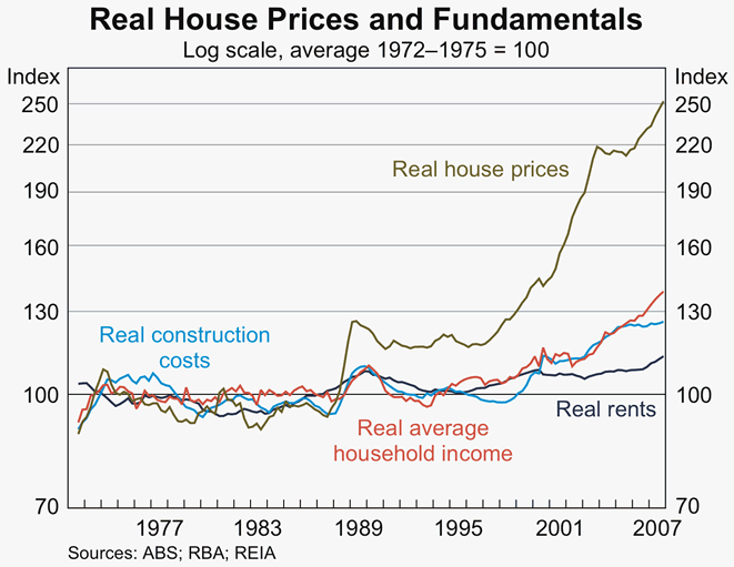
Unfortunately, this logical argument only accounts for a part of the debt build up and house price growth since the mid 1990s. The RBA graphs of household finances and real house prices (below) show clearly why this is the case.

The graph of interest paid as a proportion of disposable income shows that the actual cost of debt relative to incomes has doubled (4% to 8%) since the mid 1990s. This is clear evidence that much of the debt binge, and the subsequent house price inflation, is not attributable to the 'once-off adjustment'. This adjustment would only account for the amount of debt, and home prices, that could be supported with interest costs of 4-5% of household incomes - not 8%.
The RBA also shows that real home prices have more than doubled (100% growth) since the mid 1990s to 2007, rather than seeing 75% real gains. Indeed the 2009 boom saw real home prices inch up again (with some subsequent falls in real terms).
The ABS home price figures (though not ideal for this purpose) suggest that real home prices gained approximately 150% since 1996. That's twice what is expected from interest rate conditions alone.
To get back to that 'sustainable' point, either home prices need to fall by around 30%, or interest rates need to fall by 30% (mortgage rates to 4-5%), or some combination of the two (noting also the geographical disparity any correction is likely to have). With today's CPI print surprising many on the high side, the market prediction (and mine) of rate cuts by year's end seems far less likely. The negatively geared housing investor should take note.
In all, the meme is powerful because it is true, but dangerous because alone it is an incomplete explanation of debt and home price trends of the past two decades. What appears clear from the data is that we have overshot the expected price and debt adjustment due to the changing interest rate environment. With this in mind, the downside risks for property values appear to far outweigh any upside potential.
I think you should phrase this as "it is powerful because so far it has remained followed this"
ReplyDeletethat it is true is yet uncertain
Nice post Cam. Just a few comments that weeken Joye's arguments. First, he has only considered interest costs. Sure, while lower nominal interest rates enables a borrower to service the interest cost on a larger loan, they still have to pay back the extra principal. For instance, principal & interest repayments on a $500k 25-year loan at 7% is $815/week versus $1,154 for a $1m 25-year loan at 3.5%. The extra $339/week in repayments represents the extra principal that must be repaid.
ReplyDeleteSecond, Joye conveniently only discusses the fall in nominal interest rates. However, the reduction in real interest rates (deflated against CPI) has been smaller (i.e. 6.8% from 1982 to 1994 vs 4.6% from 1995 to 2010, a fall of only 32% versus 43% for nominal rates). Further, his chart conveniently leaves out the 1970s where real mortgage interest rates were negative.
This article talks about the distinctive generational holes inside an association. This era crevice among the staff and representatives can hurt an association that is the reason it ought to be oversee appropriately to build the cooperation and profitability of a workforce. http://www.mordocrosswords.com/2016/05/generational-disparity.html
ReplyDelete