Wednesday, September 30, 2015

How to analyse housing markets

Housing costs are typically 30% of household income, while about 43% of household savings are tied up in the value of owner-occupied dwellings. There is really no more important market for the general public to understand when it comes to their cost of living and their ability to save for the future.

But simply talking about the housing market as if it is some monolithic beast will lead you to the error of conflating three distinct markets that must be considered independently to truly understand what is happening. These markets are
  1. The land/property asset market
  2. The housing service market (annual occupancy from rent or ownership)
  3. The residential construction market
When you buy a home on the second-hand market (rather than build yourself), you are actually buying a bundled good which includes a land asset along with a durable housing product that lasts the life of the building. A close analogy would be buying a car bundled with an equity share in the vehicle manufacturer—you get the vehicle for its useful life and the equity asset in perpetuity.

So when we talk of high demand for housing, home prices increasing, and housing bubbles, we must be clear about whether we are 1) talking about the market for the land asset component of the bundled housing good, or 2) referring to the housing service market for occupying homes. Conflating these two markets is the most common error in housing market analysis and leads to conclusions that make little sense.

For example, take the frequent comments about the effect of population growth on home prices. To me, it is utterly confusing. If we are talking about the land asset market, the question then arises about why we don’t talk about the population effects on equity and debt markets, derivatives markets, and other asset classes that could equally see effects. Why would "new" people be willing to pay more for the same asset?

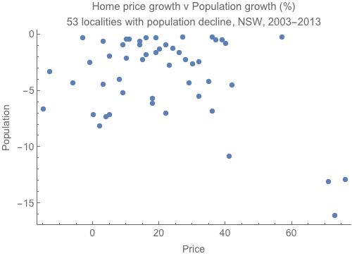
You can see from the graph below that population effects don’t seem to be a major driver of land asset price growth. Areas with a 10-15% population declines have still seen 70% growth in home prices.

Like other asset markets, the reason land prices increase has a lot to do with the reduction of interest rates in the past 20 years. Asset prices are just the capitalised value of future claims on incomes, so a lower interest rate increases that asset value compared to the value of that future income flow. This means that comparing prices of the bundle of house and land asset to incomes makes no sense at all. It would make just as much sense to compare the price of an equity share in Woolworths bundled with a kilo of bananas as a way to measure food inflation. Why not measure the food itself?

Luckily, we do have a market for housing as a produced good that we consume on an annual basis quite apart from the land asset; the rental market. If we measure how much of our incomes we spend on rent, and the quality of the homes we reside in (in terms of area per person), we can apply the supply and demand model to the market. If there really is something going on with population and housing production, it must be observable in the rental market. Looking at the chart below we can see that the rent-to-income ratio declined all the way through the land price boom of the early 2000s. So too did the occupancy rate (fewer people per home) indicating that in Australia more new homes were built than needed to house the new people to the same standard.


So sure, use your supply and demand analysis on the market for produced durable housing goods, but remember that home prices are not the price in that market. Rents are the price in the housing market, while home prices mostly reflect asset prices of the land market.

Lastly, we can look at the construction market, which is driven by trends in other markets, including speculation on land markets. Here the supply and demand approach also works, as periods of high demand for new construction result in increasing construction prices (as demand shift to the right against a resource-constrained upward-sloping supply curve for construction services). But again, the construction market and construction prices are not the main contributor to growth in home prices. In fact, higher construction costs will decrease the value of the land asset, as they provide an additional cost to capturing future income flows.

The situation now in Australia is that asset market dynamics, including lower interest rates, international buying by investors whose return is more than just financial (hence will buy with a lower yield), and simple cyclical timing of investments, are driving up land prices in some capital cities. In some areas, when this asset buying occurs in new homes it also increases demand for construction, pushing up prices in that market as well. But in the housing service (i.e. rental) market, the additional new home construction is suppressing rents.

This is the way to analyse housing markets. Don’t be drawn into the monolithic view by conflating behaviour in these distinct markets.

Thursday, September 10, 2015

Doing the housing supply maths

Laurence Murphy is a top property economist at the University of Auckland. I met him last night after a presentation in Sydney where he took on the myth that planning constraints are a major determinant of current home prices in Australia and New Zealand.

He said it is very easy to demonstrate mathematically how little impact even a large increase in the rate of supply would have on prices. But when he shows this analysis to government officials, planners, and engineers who have bought into the supply-side narrative their response is often

“I see your calculations. I follow the logic. But I don’t believe it!”

So I wanted to try the ‘basic supply-side maths’ for myself on the blog to see what sort of effects radical changes to the rate of new housing supply could have, and see if I generate some of the same responses.

Here’s how the maths work. I take the number of new dwelling completions from the ABS for the past 20 years, which is shown in quarterly figures in the blue line of the chart below. Since 1995 new housing supply has been 146,546 dwellings per year on average, which is about a 2% increase in the stock annually, though this moves with the business cycle.


I then add 10% to this number every year to generate a counterfactual world where supply has been much higher over a sustained two-decade period (green line). Then I add 20% just to take an extreme scenario (yellow line). Note that in this exercise I don’t ‘elastify’ supply, which would have higher construction rates in boom periods, and lower construction in a slump. When I run the numbers for a more elastic supply that responds more to both booms and slumps I get fewer homes built compared to what actually happened! This is because when the completion rate falls, it falls faster, offsetting all of the gains from the previous boom. I show a 'twice as elastic' scenario in the next graph in red, which actually results in 8,000 fewer dwellings built in the past 20 years. ‘Elastifying’ supply can’t really be what is desired by those advocating for supply-side reforms. 


Any supply-side housing initiative should simply aim to get more homes built, year in, year out. This is what I capture in my counterfactual scenarios of 10% and 20% higher construction over two decades.

So here is the question. How many more houses would there be now in these counterfactual worlds? And what would the price impact be?

Well, if we had built 10% more new home each year for the past 20 years Australia would have around 300,000 more homes. At a 20% higher rate of completions that's 600,000 more. Sounds terrific! That must have a massive impact on prices.

Well. No.

You see Australia’s current housing stock is somewhere around  9.3 million homes. Around 8.8 million occupied, and many second homes, holiday homes, and so forth that are traditionally about 8-10% of the housing stock. These additional homes in my 20-year supercharged supply scenarios represent just a 3.2% and 6.4% increase in total stock respectively.

The price impact of a 3% increase in supply is a 3% reduction if demand elasticity is unity. That’s it. The price reduction could be less if there are countervailing income effects that lead to outbidding for superior locations.  So twenty years of supercharged supply provides somewhere between 0% and 3% lower prices, which suggests to me that focusing on the supply side is close to a waste of time. In the 20% higher housing completions scenario the effect is somewhere between zero and 6%. About the same as two and a half years of rental price growth.

To put it another way, after 20 years of a 10% higher rate of new supply, rents today would be the same as they were in early 2014.

We can alternatively look at the raw measure of the gains to the amount of floor space per person. Taking the average floor size of homes, which is about 180sqm, and adding 3%, and assigning it to the average of 2.6 occupants, to get an additional 2sqm of floor space per person.

Or we can think of it in terms of occupancy rates — the number of people per dwelling — which would be 2.51 instead of 2.6 with the same size homes under the 10% higher supply scenario.

That’s all you get for 20 years worth of sustained housing supply stimulus. And you get none of that simply from more elastic supply only.

The point is that current massive price increases, in the order of 17% per year in Sydney and Melbourne, simply cannot be explained by anything like unresponsive supply. Not only that, any supply-side effect on prices takes many decades to have any effect, and only enters the price equation via effects on rents.

If we want cheaper housing we need to reform legal structures to shift bargaining power to tenants from landlords, curb speculation through financial controls (and keep stamp duties!), and stop rewarding political parties who promise housing supply as any sort of solution to current prices.

Unfortunately, very few people actually want housing to become cheaper. Around 70% of households are homeowners, around 30% are property investors who come from the wealthier part of society, while most politicians also have a huge share of their wealth tied up in residential property. It suits all of these interests to point the finger at supply because they know it sounds attractive in a naive economic way, but won’t actually reduce the value of their housing portfolios.

As Professor Murphy explained, the consensus around new housing supply as a solution to housing affordability problems is a political construct. This unfortunate political reality is best summarised in this tweet. 
  
Dear reader I hope you see my calculations, follow the logic and believe it!